|
| |
|
| |
|
|


|
|
TCHS 4O 2000 [4o's nonsense] alvinny [2] - csq - edchong jenming - joseph - law meepok - mingqi - pea pengkian [2] - qwergopot - woof xinghao - zhengyu HCJC 01S60 [understated sixzero] andy - edwin - jack jiaqi - peter - rex serena SAF 21SA khenghui - jiaming - jinrui [2] ritchie - vicknesh - zhenhao Others Lwei [2] - shaowei - website links - Alien Loves Predator BloggerSG Cute Overload! Cyanide and Happiness Daily Bunny Hamleto Hattrick Magic: The Gathering The Onion The Order of the Stick Perry Bible Fellowship PvP Online Soccernet Sluggy Freelance The Students' Sketchpad Talk Rock Talking Cock.com Tom the Dancing Bug Wikipedia Wulffmorgenthaler |
|
bert's blog v1.21 Powered by glolg Programmed with Perl 5.6.1 on Apache/1.3.27 (Red Hat Linux) best viewed at 1024 x 768 resolution on Internet Explorer 6.0+ or Mozilla Firefox 1.5+ entry views: 1664 today's page views: 945 (16 mobile) all-time page views: 3748067 most viewed entry: 18739 views most commented entry: 14 comments number of entries: 1258 page created Sat Mar 21, 2026 04:24:41 |
|
- tagcloud - academics [70] art [8] changelog [49] current events [36] cute stuff [12] gaming [11] music [8] outings [16] philosophy [10] poetry [4] programming [15] rants [5] reviews [8] sport [37] travel [19] work [3] miscellaneous [75] |
|
- category tags - academics art changelog current events cute stuff gaming miscellaneous music outings philosophy poetry programming rants reviews sport travel work tags in total: 386 |

| ||
|
Mr. Robo has kindly prepared a pre-preliminary technical report in between his garbage bin-toppling practice, on the efficacy of Peripheral Direction Contributivity (PDC) features on Chinese text. The implementation follows Wu & Wu (2002), though a later search reveals that these features were known since Akiyama (1990), which itself cites a 1983 paper as the source, so it should be safe to say that PDC is well-known. The most-basic pixel-by-pixel based template matching method has been previously described by Mr. Robo, particularly in the eponymous Roborovhunt, and it can be recalled that it was not especially reliable even with only a total of 52 English characters. Then, what hope Chinese, which has well over 50000 characters by most modern estimates? There are however some saving graces. In analogy with English words, some characters are far more common than others (Zipf again), and data from Middle Tennessee State University suggests that 1000 characters make up 89.14% of all text, and 97.13% for 2000 characters. Following on, the 99% mark is reached at 2838 characters, 99.9% at 4818 and 99.99% at 6485, signifying that by far the majority of extant Chinese characters are seriously rare. The other welcome realisation is that there are likely far fewer common Chinese fonts, as compared to English (imagine the pain of a designer crafting even 5000 characters from scratch), which means that plenty of encountered text should be in an exactly-known font.  This means (fittingly): verbose (Source: wordvirus.us) Back to the PDC feature model, what it does is basically to examine a character from all directions, and then at each of the first three white-to-black crossings encountered, obtain the stroke lengths in each of the eight cardinal directions. This would give 12288 dimensions for 64x64 images if all data is kept, which is a lot, and therefore it is usual to average the values in groups of eight scanlines, for 1536 dimensions. It is common to further reduce the number of dimensions through techniques such as K-L transform and LDA, omitted here. This model does have its shortcomings, one easily observed example of which is the analysis of strokes that are slightly slanted and/or thin. Taking PDC vectors as trying to describe strokes, an ideal horizontal stroke would have, after normalization, a sum of near 1 in the east-west directions, and near 0 elsewhere. However, if the stroke were even slightly rising (or falling), the horizontal scanline might persist for only a few pixels, not much more if at all than the vertical ones, even though it is clear to a human observer that the stroke is near-horizontal. 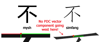 Example with"No" in two fonts (3 of 8 directions shown) - not all horizontal strokes are the same! Note the PDC component in red for mysh completely absent in simfang As such, correction by skeletonization does not help here (attempted and verified) Despite this, PDC does give surprisingly decent out-of-the-box results. A simple experiment was run using some 20000 characters of Unicode value from 19968 to 40959, on five common fonts - msyh, msyhbd, simfang, simhei and simkai. Unsurprisingly, each font had perfect recognition when tested against itself (vector distance zero), with a median second-best character distance of some 1000-plus. Things get more interesting when the fonts are tested against each other (i.e. PDC features are obtained from one font, and tested using samples from another font; in each cell, first row is the cross-recognition accuracy rate with 1000 characters, second with 2000, and third with all):
It is observed that when testing on a poorly-matched font, recognition accuracies can fall as low as 25%, though this should be seen in light of there being over 20000 classes. However, in practice, picking the correct (or best) font from the character distance should be straightforward, so this is not as huge an obstacle as it may seem. 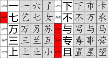 Cross-font examples. Indexes of misclassified characters in red. Note some of these have the correct character in second or third place. Now, one can hardly expect a truly 100% recognition rate even when the font is known, and research generally claims rates ranging from 97% to over 99% on same-font tests. It should be remembered that these results can be affected by many factors, most importantly probably being the size of the corpus (recognition should be easier for 1000 characters tested on themselves, as opposed to 100000 characters), as well as the quality of the test data (clean, high-resolution [300 dpi and above recommended] characters are clearly easier to recognize than small, faint and blurred ones) As a practical demonstration, a couple of actual documents were scanned, with no particular care taken (note creases) 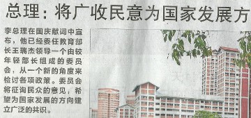 Not shown at actual size In an admittedly small-scale experiment, 100% perfect recognition was achieved on headline text, of dimensions about 90x90 pixels (average character distance of 550). On the boldfaced body text, raw size about 40x40 pixels, an 83.75% recognition was achieved. The next example will be the first page of the Three-Character Classic (obtained in Malaysia, well-thumbed by my grandma). It has been scanned at a relatively low resolution, such that each character is only about 28 pixels square (only about a quarter the size of the standard 64x64 template), with some characters near the binding further blurred. 900 characters (some duplicated in the text) were automatically extracted, and tested using the simhei font, with manual ground truth. 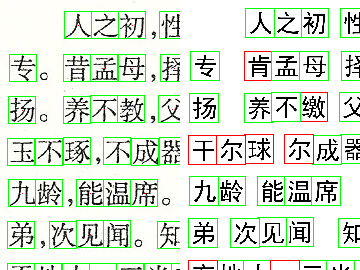 Original on left, recognized characters on right (Full side-by-side comparism) Using only the most common 2000 characters, 82.22% accuracy was achieved, and with all available 20000-odd characters, 79.67% was achieved. Note that using the smaller set gives up some possible recognitions because the character is simply not in the set, while using the larger set picks up some of these, but also admits more confusion due to there being more characters to match against:
Some of the successful recognitions were fairly surprising, given broken lines and loss of detail, with some mistakes probably explained by the loss of the bottommost horizontal stroke. Other known approaches include Gabor features and deformable meshes (especially for handwritten text), but these will be left for the future. It's All Japanese To Me (Greek May Be Easier) As it is unsatisfying to stop here, Mr. Robo wondered if there was a useful extension, when my trip to Tokyo came to mind. The language barrier is often a concern when travelling, and although recent visitee twc maintained that communication was adequately covered by the mechanism of "the finger", perhaps a more involved solution might be in order. Now, the Chinese and Japanese languages have their similarities, and while not descended from a common tongue, many (modified) Chinese characters are employed in written Japanese. 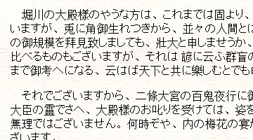 Doesn't help all that much though (Source: etext.virginia.edu) It might be considered a mixed blessing for local Chinese to have to pick up both English and Chinese in their youth - Chinese (together with Japanese, Korean, Cantonese and Arabic) are considered the hardest languages for native English speakers, and I am not sure if I would have bothered to learn Chinese had I not been exposed to it early. My attempt at Japanese while in secondary school was short-lived, sadly, but this may yet be corrected in time (see some opinions on its difficulty, as compared to Chinese) A quick and dirty primer on the Japanese language: the written form is considered among the most complex, since other than the kanji (汉字), which is basically Chinese, there are two native syllabary systems (which can be thought of as phoenetic alphabets) - hiragana and katakana (more for foreign loanwords, not to be confused with katana), each with 48 characters (or more) and their associated pronunciation. But being fluent in Chinese should help, no? Well, put it this way - most of the kanji can be understood, but as unfortunately seen in the above example, they tend to be broken up by swathes of hiragana, with the effect being like reading redacted text - one gets fragments of the idea, but often doesn't actually understand much. It probably only gets worse when spoken. With text, one at least has time to try and figure the context, and worse still, the pronunciation tends to bear but a very fleeting resemblance to the Chinese equivalent (though I do consider myself having a fair ear for dialect), and moreover multiple pronunciations for the same character are possible; then there's simply going Kaa! for car. [N.B. Just for fun, the direct translation of my Chinese name 林勇山 comes out as Hayashi Yuuyama. Hayashi was not that hard to find, given that it is a pretty common surname in Japan (and even appears in the kanji chart for first grade - see full primary school list), while a cursory acquaintance with sumo ensures the -yama (mountain) suffix comes up often enough to stick. Yuu- for courage/bravery was a bit tougher, and as it turns out Yuuyama seems not to be that common a pairing, with only one fictional character coming up in Google (and that with Yuu- coming from "swim" instead] On to the implementation, is there a way to get the required data? Mr. Robo quickly discovered Tagaini Jisho, a free and open-source Japanese dictionary, from which one can extract plenty of kanji, and their hiragana and English equivalents: 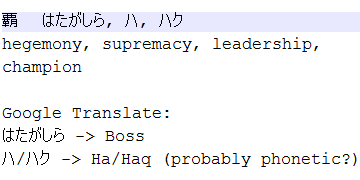 Subtleties may not be reflected in hiragana One could then imagine recognizing Japanese in much the same way as Chinese, but with the extra hassle of handling hiragana and katakana spanning multiple characters. Put Into Practice On to the app itself, Mr. Robo recommends following the official first tutorial, which involves downloading the Android SDK, then following the instructions. Those without a suitable phone can use an emulator, but in this case USB Debug Mode worked flawlessly on the HTC (take care, when running the app, to have a code and not xml file in focus in Eclipse) 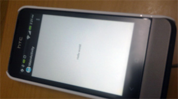 And... helloooo world! The next step would be to interact with the camera and process captured images (many tutorials available), or even video, but we're out of time. Land of the Rising Sun, here I come (don't expect many updates over the next fortnight) Next: Conference Report
|
||||||||||||||||||||||||||||||||||||||||||||||||||||||||||
 Copyright © 2006-2026 GLYS. All Rights Reserved. |
||||||||||||||||||||||||||||||||||||||||||||||||||||||||||