|
| |
|
| |
|
|


|
|
TCHS 4O 2000 [4o's nonsense] alvinny [2] - csq - edchong jenming - joseph - law meepok - mingqi - pea pengkian [2] - qwergopot - woof xinghao - zhengyu HCJC 01S60 [understated sixzero] andy - edwin - jack jiaqi - peter - rex serena SAF 21SA khenghui - jiaming - jinrui [2] ritchie - vicknesh - zhenhao Others Lwei [2] - shaowei - website links - Alien Loves Predator BloggerSG Cute Overload! Cyanide and Happiness Daily Bunny Hamleto Hattrick Magic: The Gathering The Onion The Order of the Stick Perry Bible Fellowship PvP Online Soccernet Sluggy Freelance The Students' Sketchpad Talk Rock Talking Cock.com Tom the Dancing Bug Wikipedia Wulffmorgenthaler |
|
bert's blog v1.21 Powered by glolg Programmed with Perl 5.6.1 on Apache/1.3.27 (Red Hat Linux) best viewed at 1024 x 768 resolution on Internet Explorer 6.0+ or Mozilla Firefox 1.5+ entry views: 2058 today's page views: 555 (23 mobile) all-time page views: 3732599 most viewed entry: 18739 views most commented entry: 14 comments number of entries: 1256 page created Fri Mar 6, 2026 13:49:03 |
|
- tagcloud - academics [70] art [8] changelog [49] current events [36] cute stuff [12] gaming [11] music [8] outings [16] philosophy [10] poetry [4] programming [15] rants [5] reviews [8] sport [37] travel [19] work [3] miscellaneous [75] |
|
- category tags - academics art changelog current events cute stuff gaming miscellaneous music outings philosophy poetry programming rants reviews sport travel work tags in total: 386 |

| ||
|
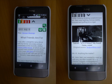
- changelog - changelog v1.16 --------------- * bert's blog mobile beta released at http://blog-m.glys.com, with automatic detection and redirection from smartphones! It won't make much sense when not viewed on a mobile device... It's been over a year since the last platform update, but that doesn't mean I've given up on improving glolg, not at all. While the full overhaul is scheduled for after I finally graduate, I couldn't resist starting off the adaptation process with a mobile version of the blog:  Easy reading for my mobile visitors Before this, it was a right pain attempting to read this blog from a smartphone, given that it was designed for far larger screen resolutions. Oh, it could be done with a lot of pinching to zoom in to the requisite scale, but that and a lot of extraneous detail (and resulting bandwidth hogging) understandably can make users wonder at the point of it all. But now, with the spanking new mobile version, only the meat is displayed, with a no-frills design taking into consideration how valuable real estate is at 320x480, and a font size suited for comfortable prolonged viewing. As seen in the right half of the above image, nearly all the screen is made available for the content when in the process of reading. Tapping the header or scrolling to the top will cause an all-in-one navigation menu to expand, which allows the user to either search the contents, or filter posts by date by tapping the desired year or month. All link elements are placed with tappable size considerations in mind. Not all elements have been integrated - comments and tags being two of the more obvious omissions - but the mobile site is currently perfectly serviceable, or as much as a mobile site can be, anyway. Next: Some Things
|
|||||||
 Copyright © 2006-2026 GLYS. All Rights Reserved. |
|||||||